
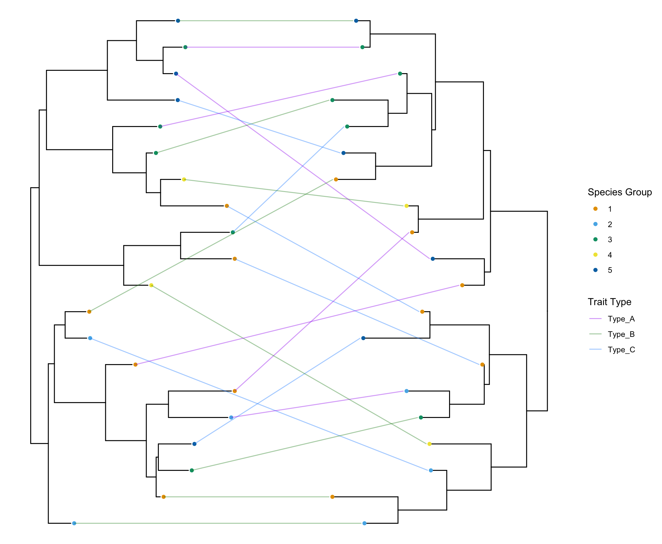
Tanglegram is a representation of co-phylogeny where tips of two phylogenetic trees are linked. This method is super useful to visualize common traits shared by both trees. For example, it can be used to visualize host-pathogen (or host-symbiotic) evolution and see if there is any phylogenetic concordance between the two phylogenetic trees.
I was in need to visualize co-phylogeny of phylogenetic tree reconstructed from chromosomal and symbiotic genes. Surprisingly, I didn’t find any straight-forward solution in R that can be used for drawing tanglegram. Particularly I wanted to leverage the beautiful ggtree library. After trying out several methods, I found the following approach works well for me so far. I have released a small R package on it, which can be found on GitHub.
How to make a Tanglegram from scratch
Since my original post on creating co-phylogeny (tanglegram) plots in R, I’ve received a lot of great feedback and questions. Many of you pointed out a common headache: when connecting two trees, the lines often cross over each other into a tangled mess, making it hard to see true concordance. Others asked how to stop the connecting lines from striking through the tip labels. And why stops at visualizing two trees? Why not three or more?
Here is how to build a clean, customizable tanglegram from scratch.
Let’s load some necessary libraries in R
library(ggplot2)
library(ggtree)
library(phangorn)
library(dplyr)
library(ggnewscale) # Required for new_scale_color()
library(ape)        # Required for generating random trees
I have been using and improving the core function for plotting tanglegrams for my research for a while. I’m sharing an updated, highly customizable method using base ggtree and ggplot2. This new approach includes a pre.rotate function that automatically flips nodes to minimize line crossing, and a lab_padargument to neatly offset the connecting lines from your labels.
Here are the two powerhouse functions for our new tanglegram workflow. You can load these directly into your R environment.
Function 1: pre.rotate() This function takes two phylogenetic trees and uses phytools::cophylo to rotate their internal nodes. This aligns the tips of both trees as closely as possible, dramatically reducing the “tangle” in the final plot.
pre.rotate <- function(tree1, tree2) {
  cophylo <- phytools::cophylo(tree1, tree2)
  rotated_tree1 <- cophylo[[1]][[1]]
  rotated_tree2 <- cophylo[[1]][[2]]
  return(list(rotated_tree1, rotated_tree2))
}
Function 2: common.tanglegram() This is the upgraded plotting function. It handles the alignment, tip connections, and coloring all in one go. Notice the added lab_pad parameter. This lets you add space between the tip and where the connecting line starts, so lines no longer cross through your text or tip points!
common.tanglegram <- function(tree1, tree2, column, sampletypecolors=NA,
                              t2_pad = 0.5, t2_y_scale = 1, t2_y_pos = 0,
                              lab_pad = 0.05, tiplab = FALSE, t2_tiplab_size = 3,
                              t2_tiplab_pad = 0) {

  # Extract tree data
  d1 <- tree1$data
  d2 <- tree2$data

  # Update the associated variable
  d1$tree <- 't1'
  d2$tree <- 't2'

  # Logic for rotating tree 2:
  # 1. (max(d2$x) - d2$x) perfectly flips the tree so tips face left.
  # 2. + max(d1$x) places it immediately to the right of Tree 1.
  # 3. + t2_pad adds the horizontal gap between them.
  d2$x <- (max(d2$x) - d2$x) + max(d1$x) + t2_pad
  d2$y <- d2$y * t2_y_scale
  d2$y <- d2$y + t2_y_pos


  # Draw cophylogeny
  pp <- tree1 + geom_tree(data=d2, layout = "dendrogram") +
    geom_tippoint(data = d2, aes(x = x-0.005, y = y, color=ani.spp)) +
    geom_treescale(x=0.1, y=10)

  # Merge tree data for tips only
  combined_data <- rbind(d1, d2) %>% filter(isTip == TRUE)

  # Create lines connecting the tips and assign padding
  combined_data <- combined_data %>%
    group_by(label) %>%
    mutate(
      lab_x = case_when(
        tree == "t1" ~ x + lab_pad,
        tree == "t2" ~ x - lab_pad,
        TRUE ~ x
      )
    ) %>%
    ungroup()

  # Add connecting lines colored by the trait category
  pp <- pp +
    new_scale_color() +
    geom_line(
      aes(
        x = lab_x,
        y = y,
        group = label,
        color = .data[[column]]
      ),
      data = combined_data,
      alpha = 0.4
    )

  # Apply custom or default colors
  if (missing(sampletypecolors) || is.null(sampletypecolors)) {
    pp <- pp + scale_color_viridis_d(option="turbo")
  } else {
    pp <- pp + scale_color_manual(values = sampletypecolors)
  }

  # Optionally show tip labels for tree 2
  if (tiplab) {
    pp <- pp +
      ggtree::geom_tiplab(
        aes(x = x - t2_tiplab_pad),
        size = t2_tiplab_size,
        data = d2,
        hjust = 1
      )
  }

  return(pp)
}
Now, showtime! Let’s generate some dummy data to visualize the tanglegram.
set.seed(42)
t1 <- phangorn::midpoint(ape::rtree(20))
t2 <- phangorn::midpoint(ape::rtree(20))

# Ensure the tip labels match between both trees
t2$tip.label <- t1$tip.label

# Create a dummy metadata frame matching the tip labels
meta <- data.frame(
  label = t1$tip.label,
  ani.spp = as.character(sample(1:5, 20, replace = TRUE)),
  plasmid.type = sample(c("Type_A", "Type_B", "Type_C"), 20, replace = TRUE)
)
These trees look like this:
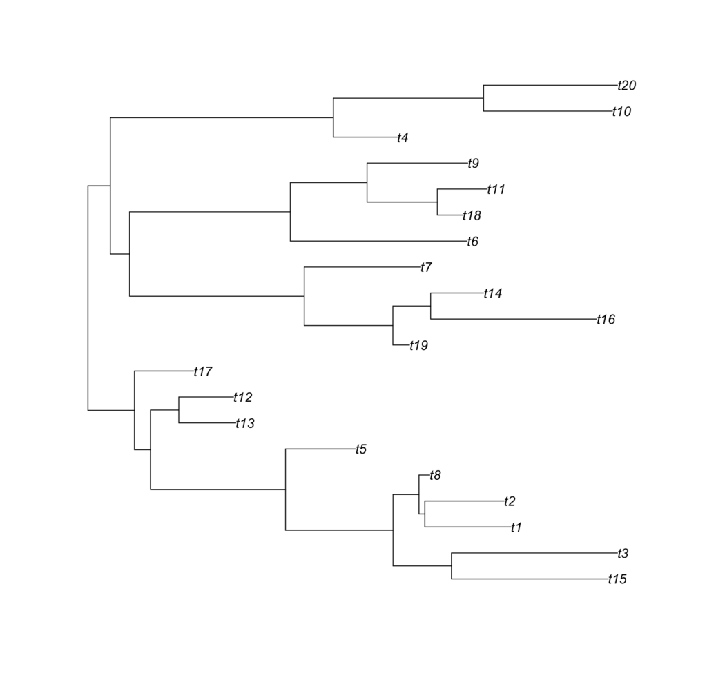
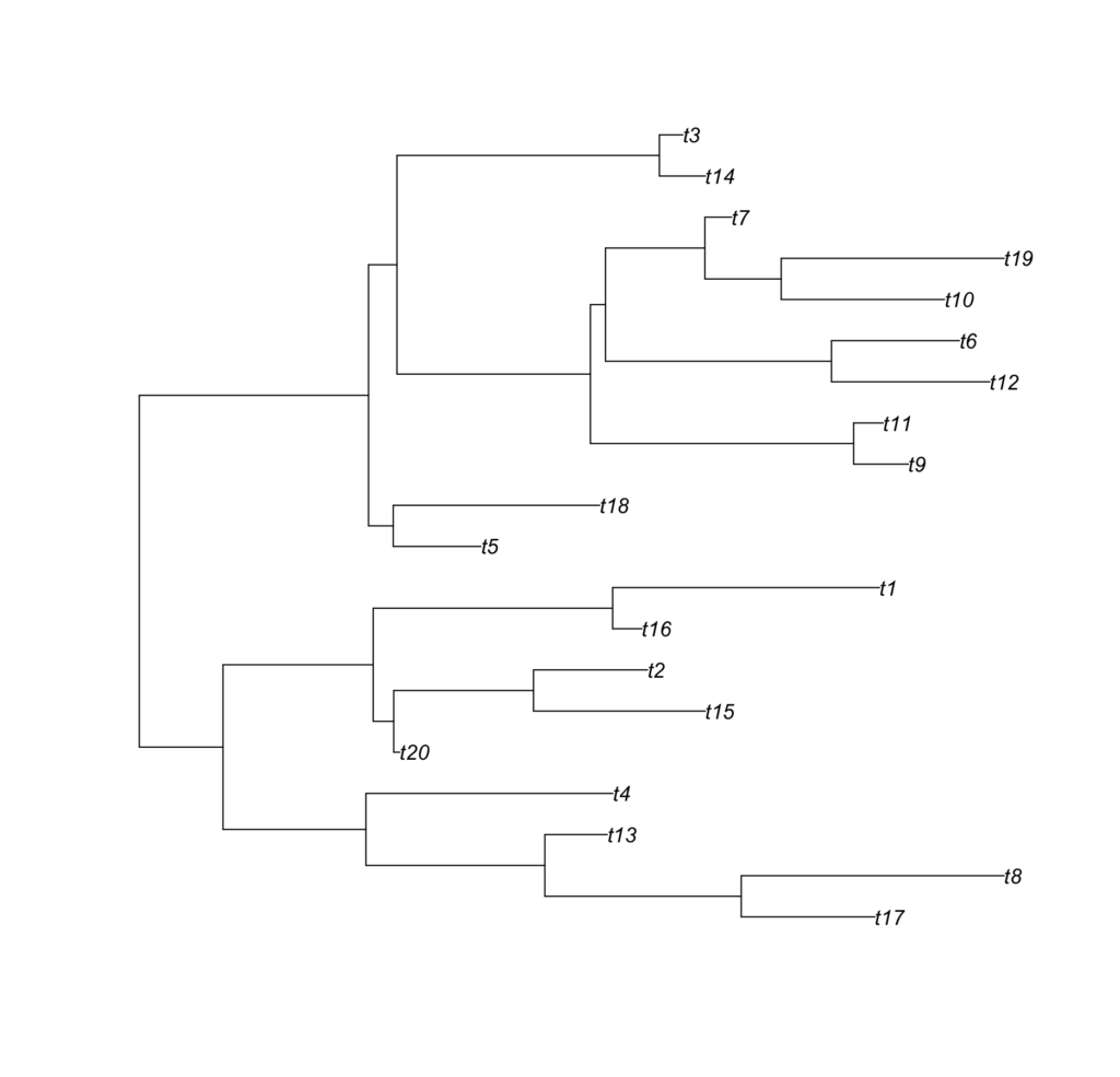
Meta look like the following:
> head(meta)
  label ani.spp plasmid.type
1   t12       2       Type_A
2    t2       4       Type_A
3   t14       2       Type_C
4    t3       3       Type_B
5    t1       2       Type_B
6   t10       1       Type_C
Time to rotate the trees, define colors because we love customization, annotate the trees, and draw the final tanglegram!
rotated_trees <- pre.rotate(t1, t2)

t1 <- rotated_trees[[1]]
t2 <- rotated_trees[[2]]

# Define some colors for the tree points based on our dummy Species (1-5)
species_colors <- c("1"="#E69F00", "2"="#56B4E9", "3"="#009E73", "4"="#F0E442", "5"="#0072B2")

# Define colors for the connecting lines based on our dummy Traits
trait_colors <- c(
  "Type_A" = "purple",
  "Type_B" = "forestgreen",
  "Type_C" = "dodgerblue"
)


# Annotate Tree 1
tree1 <- ggtree(t1, ladderize=FALSE) %<+% meta +
  geom_tippoint(aes(x = x + 0.05, color = ani.spp)) +
  scale_color_manual(values = species_colors, name = "Species Group")

# Annotate Tree 2
tree2 <- ggtree(t2, ladderize=FALSE) %<+% meta


# Draw the final tanglegram
common.tanglegram(tree1, tree2, column = "plasmid.type",
                  lab_pad = 0.05, t2_tiplab_size = 3,
                  t2_y_scale = 1, t2_y_pos = 0, t2_tiplab_pad = 0.5) +
  scale_color_manual(values = trait_colors, name = "Trait Type")
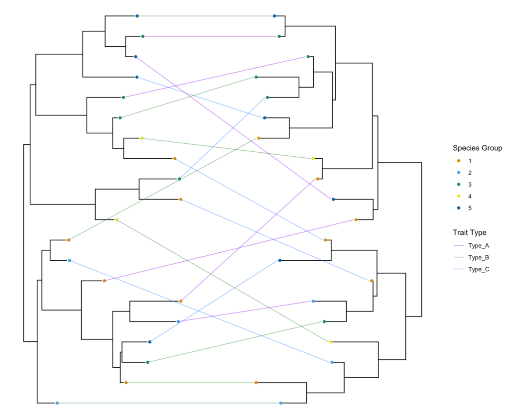
And voilà!
Plotting three trees in the tanglegram
To add a third tree (or fourth, or n-th) into the mix, we can expand our logic. ggplot2 and geom_line make this surprisingly elegant. Because geom_line() automatically connects points from left to right based on their x-coordinates, all we have to do is place Tree 2 to the right of Tree 1, and Tree 3 to the right of Tree 2.
Here is an updated function, triple.tanglegram(), designed to handle three trees. It will leave Tree 1 facing right, flip Tree 2 (facing left), and flip Tree 3 (facing left, positioned furthest to the right).
triple.tanglegram <- function(tree1, tree2, tree3, column, sampletypecolors=NA,
                              t2_pad = 0.5, t3_pad = 0.5,
                              t2_y_scale = 1, t2_y_pos = 0,
                              t3_y_scale = 1, t3_y_pos = 0,
                              lab_pad = 0.05) {

  # Extract tree data
  d1 <- tree1$data
  d2 <- tree2$data
  d3 <- tree3$data

  # Update the associated variable
  d1$tree <- 't1'
  d2$tree <- 't2'
  d3$tree <- 't3'

  # Position Tree 2: Flipped and placed to the right of Tree 1
  d2$x <- (max(d2$x) - d2$x) + max(d1$x) + t2_pad
  d2$y <- d2$y * t2_y_scale + t2_y_pos

  # Position Tree 3: Flipped and placed to the right of Tree 2
  d3$x <- (max(d3$x) - d3$x) + max(d2$x) + t3_pad
  d3$y <- d3$y * t3_y_scale + t3_y_pos

  # Draw the base trees
  pp <- tree1 +
    geom_tree(data=d2, layout = "dendrogram") +
    geom_tippoint(data=d2, aes(x = x - 0.005, y = y, color=ani.spp)) +
    geom_tree(data=d3, layout = "dendrogram") +
    geom_tippoint(data=d3, aes(x = x - 0.005, y = y, color=ani.spp))

  # Merge tree data for tips only
  combined_data <- rbind(d1, d2, d3) %>% filter(isTip == TRUE)

  # Assign padding for the connecting lines
  combined_data <- combined_data %>%
    group_by(label) %>%
    mutate(
      lab_x = case_when(
        tree == "t1" ~ x + lab_pad,
        tree %in% c("t2", "t3") ~ x - lab_pad, # Both t2 and t3 face left, so lines start to their left
        TRUE ~ x
      )
    ) %>%
    ungroup()

  # Add connecting lines colored by the trait category
  # geom_line automatically connects t1 -> t2 -> t3 based on the x-coordinates
  pp <- pp +
    new_scale_color() +
    geom_line(
      aes(
        x = lab_x,
        y = y,
        group = label,
        color = .data[[column]]
      ),
      data = combined_data,
      alpha = 0.4
    )

  # Apply custom or default colors
  if (missing(sampletypecolors) || is.null(sampletypecolors)) {
    pp <- pp + scale_color_viridis_d(option="turbo")
  } else {
    pp <- pp + scale_color_manual(values = sampletypecolors)
  }

  return(pp)
}
Let’s do a toy example:
# Random midpoint-rooted trees
t1 <- phangorn::midpoint(ape::rtree(20))
t2 <- phangorn::midpoint(ape::rtree(20))
t3 <- phangorn::midpoint(ape::rtree(20))

# Create base ggtree objects using previously defined meta
tree1 <- ggtree(t1, ladderize=FALSE) %<+% meta +
  geom_tippoint(aes(x = x + 0.05, color = ani.spp)) +
  geom_treescale()

tree2 <- ggtree(t2, ladderize=FALSE) %<+% meta + geom_treescale()

tree3 <- ggtree(t3, ladderize=FALSE) %<+% meta + geom_treescale()

# Plot all three
triple.tanglegram(tree1, tree2, tree3, column = "pTi.Type",
                  t2_pad = 1, t3_pad = 1,  # Control spacing between the trees
                  lab_pad = 0.05) +            # Keep lines from striking the nodes
  scale_color_manual(values = trait_colors)
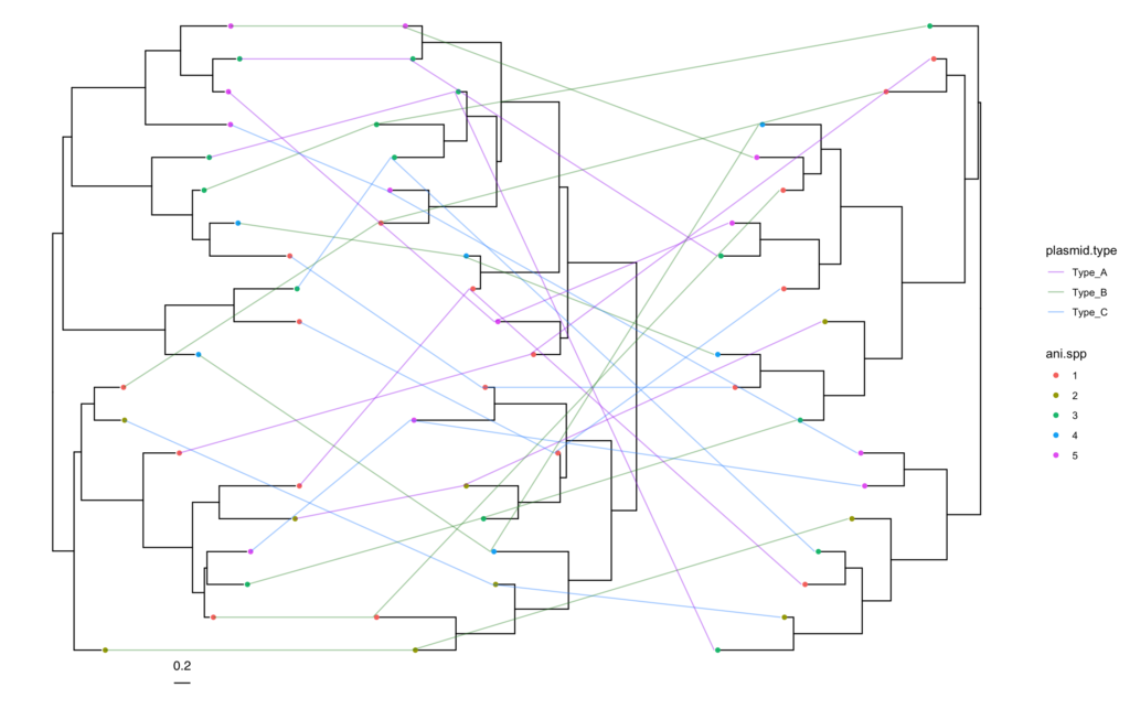
Notice we cannot use pre.rotate function here, because phytools::cophylo is designed to minimize crossing between two trees. You can try sequentially rotating them (e.g., align t1 and t2, then use the rotated t2 to align t3)
Tangler: The R package
Due to the popularity of this tutorial, I have released a small R package that can help you to draw simple tanglegram from two ggtree objects.
The R package called TangleR, currently released in GitHub.
You can download it in R using the following command:
library("devtools")
install_github('acarafat/tangler')
Here’s how to use this TangleR package:
library(ggtree)
library(tangler)
library(ggnewscale)
library(dplyr)
library(ggplot2)

# Load trees
t1 <- read.tree('data/tree1.nwk')
t2 <- read.tree('data/tree2.nwk')

# Load meta
meta=read.csv('tree_meta.csv', header=T)

# Annotate trees
tree1 <- ggtree(t1)   %<+% meta +
  geom_tiplab() +
  geom_tippoint(aes(color=Genotype))


tree2 <- ggtree(t2) %<+% meta + geom_tiplab()

# Draw Tanglegram
simple.tanglegram(tree1, tree2, Genotype, Green, tiplab = T)

# Update the connecting line x-position so that it do not overlap with tip-labels.
simple.tanglegram(tree1, tree2, Genotype, Green, l_color = 'green3',  t2_pad = 0.3,
                  tiplab = T, lab_pad = 0.1, x_hjust = 1, t2_tiplab_size = 3)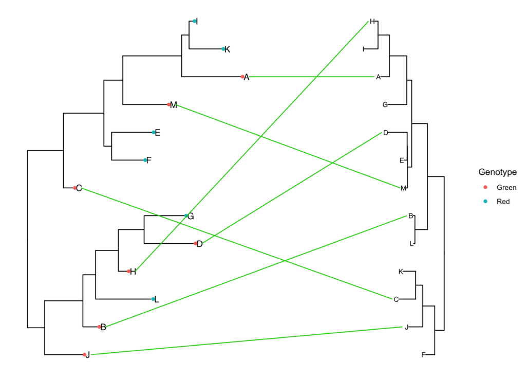
Now let’s say you want to reorder the tips of both phylogeny so that the tips are better aligned, however the overall tree toplogy is unchanged. For that you can use the pre.rotate function. The only difference is, you need to make sure that you are using ladderize=FALSE when converting the rotated tree in a ggtree object, otherwise ggtree will override tip-order.
# Rotate the internal nodes so that tips of both trees are aligned
rotated_trees <- pre.rotate(t1, t2)

t1 <- rotated_trees[[1]]
t2 <- rotated_trees[[2]]

# Annotate Trees, make sure to set ladderize=F
tree1 <- ggtree(t1, ladderize=F)   %<+% meta +
  geom_tiplab() +
  geom_tippoint(aes(color=Genotype))

# Annotate Tree 2
tree2 <- ggtree(t2, ladderize=F) %<+% meta + geom_tiplab()


# Tanglegram, no line color
simple.tanglegram(tree1, tree2, Genotype, l_color = 'green3', Green, t2_pad = 0.3,
                           tiplab = T, lab_pad = 0.1, x_hjust = 1, t2_tiplab_size = 3)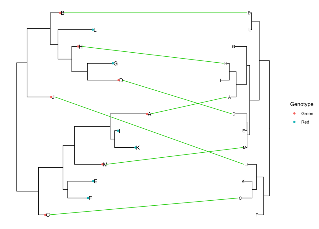
You can also draw tanglegram for all traits in the column using common.tanglegram function.
common.tanglegram(tree1, tree2, column = 'Genotype', sampletypecolors = c('green4', 'red'), t2_pad = 0.3,
                           tiplab = T, lab_pad = 0.1, t2_tiplab_size = 3)


Leave a Reply